I’m a huge fan of alcohol markers. I’ve taken several classes, and I have spent a lot of hours practicing. I’ve only recently discovered the Stampin’ Blends.
Every time I place an order, I add a couple of markers to my collection! I’m learning what I like about them and what combinations of colors I like for various objects. I’ve been watching other Stampin’ Up! demos videos to see what tips and tricks they have to share, and I am making my own list as well.
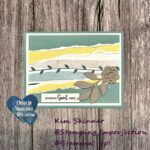
Today’s card used the new sketch for this week from the Atlantic Hearts Sketch Challenge and the Stampin’ Blends combination I discovered that I love for butterflies. I used the Perennial Lavendar Designer Series Paper to create a double page scrapbook layout, and I wanted to make some butterflies to match the ones on the paper. This is what I came up with!
I love the final result!!
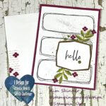
Here is the Atlantic Hearts Sketch Challenge that I started with:
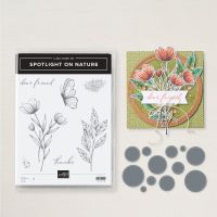
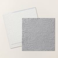
I used the Exposed Brick embossing folder and the Spotlight on Nature stamp and die set.
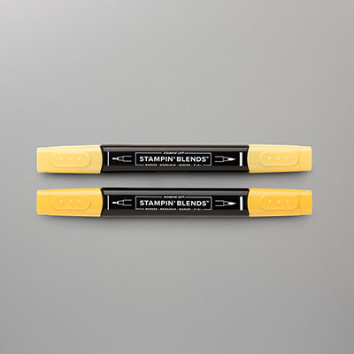
The circle die is cut from Lemon Lolly card stock. Isn’t this a pretty shade of yellow?
The butterflies and leaves are stamped in Memento, colored with Stampin’ Blends and fussy cut out.
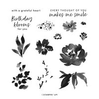
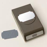
The sentiment is from the Textured Florals stamp set and I used my Labeled with Love punch! A few metallic embellishments in copper finished it off.
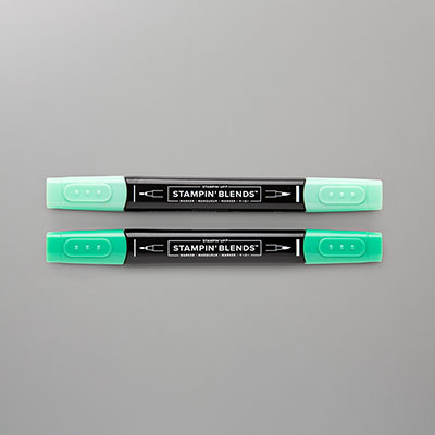
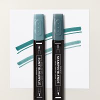
For the leaves, I used a combination of dark and light Pretty Peacock and Lost Lagoon. I also added in some Shaded Spruce.
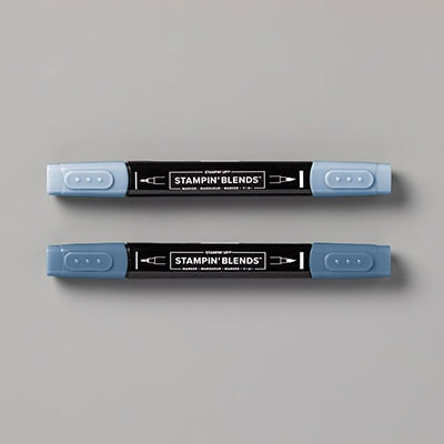
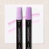
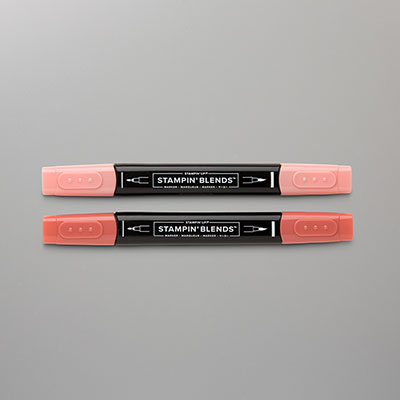
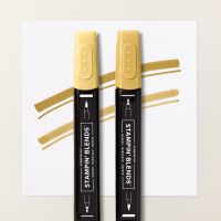
For the butterflies, I used dark and light Misty Moonlight, Dark and Light Fresh Freesia, Dark Calypso Coral, Dark Wild Wheat, Dark Daffodil Delight.
My Stampin’ Blend Tips:
- Mix colors! Don’t just get stuck on using only a dark and light of one color…you won’t get the color depth you are looking for. Pull out other colors and combine them.
- Use your Smokey Slate and Pebbled Path to shade where you want things to appear darker or where you want a drop shadow. Be bold about it!
- Use thicker paper. I didn’t do that here and you can see some bleeding of the darker colors into that yellow. I’m not a perfectionist and neither is nature, so that doesn’t bother me.
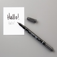
- Use a 0.1 or 0.3 black journaling pen to go over your image lines when you are done coloring. This takes a little practice, but it covers those little slips outside the lines, and it gives you a more finished look.
- Learn to flick and stipple! Those are the two most important strokes when you are using Blends!
- Keep a record of the color combinations that you love.

This is a trick I learned from Patty Bennett, Keri Boucher, and Lounon. Keri is one of the most beautiful colored pencil colorists I’ve ever seen. Lounon, from Craft.me.Craft.moi, is the most amazing alcohol marker colorist. Definitely follow these ladies on Instagram because they share their talents and their color combinations!
I’ve started to make color swatches like they do so that I remember what colors I liked together in past projects. I’m making 4 x 6″ cards, stamping an image and coloring it in. Then I’m listing the colors and swatches on the card.
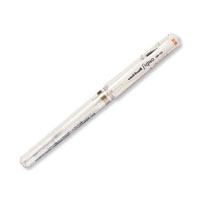
You will notice on the card that I used some white gel pen to add highlights to my images. I have not quite mastered leaving white spaces without color for the highlight as I color! That is a skill that I’m still working on! White gel pen to the rescue!
Product List
Thank you for stopping by!
Be well and stay crafty!
