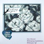
My card today was inspired by two things: Altenew Academy’s With A Twist class and Lydia Evan’s Video on coloring on dark colors.
I truly enjoyed the With A Twist class. The lessons really made me think of how I can use my stamps in unusual or surprising ways. I can’t wait to have time tomorrow to play with some of the other ideas and lessons shared by the instructor. One of the lessons was to use unusual color combinations and it reminded me of a video I made a couple of years ago on using bright embossing powders on a black background. Then I saw a video made by Lydia Evans about coloring on dark backgrounds and I just had to try it. In the video, Lydia used the Floral Shadows stamp set which is one of my favorite stamp sets. Her card was created on a navy blue background and to call it stunning just does not do it justice.
I had to give that a try! This is one of those techniques I will continue to practice because it was therapeutic to do and the results can be amazing. Keep in mind that this is my first try, but I’m pretty happy with the results.
I think that it is unexpected to use a bright color on such a dark background, but ever since I created cards using bright colors of embossing powder on a black background it has really been one of my favorite unexpected techniques.
The instructor made a beautiful card combining orange and pink! It sounds crazy, right?! It was beautiful. One tip she shared with us was that if you aren’t sure about how to use your colors, select 3 colors and use the 70-20-10 rule. One color should be about 70% of your card. For this card, that would be the black. One color should be about 20% of the card and that is my purple. The other color should be about 10% of the card and that is my green. I have added a touch of gold and yellow for a pop and of course my sequins and droplets.
The real treat was watching Lydia color using colored pencils!! I had to try this myself and i love it!
The image is actually stamped in white ink. I used StazOn white ink because that is what I have in my stash. Then you color over the top of the ink when it dries.
This stamp set is the same set I used in my previous post. It looks completely different with this technique. Check that post out here and see it for yourself! I created 2 cards with slightly different techniques in that post, but you would not know it was the same stamp set here!
This is Altenew’s Stunning Cosmos stamp set and I am in love with it. The fact that I’ve used it in 3 ways and I have yet to actually stamp the layers the way the stamp was intended to be used makes me realize how much more I can do with my stamps and my stash!
I am by no means an expert colorist, but I have been coloring a little each day and I definitely think I have improved. The instructor that taught the Beautiful Details class was an AMAZING colorist and she stressed the importance of just coloring each day to improve your skills. She said she watched a lot of videos and practiced, practiced, practiced.
What great advice. You can’t just try something once and expect it to be perfect after watching one video.
Plus, have you tried coloring with colored pencils or alcohol markers lately? It is ridiculously relaxing. I think it is worthwhile to stamp up a bunch of images and then spend some time catching up on your shows and coloring.
Card Details:
Black card stock: Card base cut at 4-1/4 x 11″, scored at 5-1/2″, card front cut at 4-1/4 x 5-1/2″, sentiment strip cut at 3/8″ and trimmed to fit.
Gold Metallic Foil cut 1/2″ and trimmed to fit in length
Colored Pencils: This is an old Derwent Studio set of colored pencils that my husband gave me for Christmas about 5 years ago. I’m sure that it wasn’t expensive, but it came in a nice tin and it is easy to carry around the house and sit on any surface next to me while I color. I actually used 3 shades of purple and a medium pink, 2 shades of yellow and an orange, two shades of green and a touch of white.
Clear Sequins and Droplets are from Pretty Pink Posh.
Ink: White StazOn ink
Stamp Set: Altenew Stunning Cosmos
I did not stress over the coloring. I flicked the colors like Lydia did in the video starting with my darkest, then my medium and then the lightest around the top of each petal. I also used the lightest shade to create the petals that don’t really exist with this floral stamp if you use the layers as it was intended to be used.
One stamp set 3 different ways and I haven’t even stamped with it yet in the “normal” way! I’m loving it! What a great way to stretch your stamping supplies and get more for your money!
Thank you so much for stopping by today!! I hope you find time to craft and remember to embrace the imperfections!


What an excellent write-up, Kim!! love your gorgeous result!
Thank you, Virginia!!