I had so much fun with my Sunny Studio stamps yesterday, that I didn’t bother cleaning up my craft table. I just moved on to the next card I had in my head to create with this fabulous new fall release.
I love the Sunny Studio Autumn Splendor and the Autumn Greetings stamp sets. I decided that I wanted to make one of my favorite card layouts with these two sets.
I’ve been trying to make more single layer cards using techniques that I’m am either learning or revisiting. Sometimes you learn about a technique, play with it awhile and then you don’t use it again for a long time.

This is one of my favorite card layouts and it is only one layer. I added some dimension on the card using a drop shadow around my stamped images and the sentiment “strip”. I was hoping to create a card that looked like it had layers, when in fact, it doesn’t.
I used the Autumn Splendor and the Autumn Greetings stamp sets from the new Sunny Studio release. I only used a few of the stamps from these two sets and I didn’t use the coordinating dies. I have a lot more stamping potential with these stamps!

I also pulled out some of my Catherine Pooler Designs inks. I love the vibrant colors in her line of inks and I really love that you can stamp more than one color on a stamp at one time without transferring the ink onto the next ink pad.
When I was trying to decide which colors to use, I decided to pull out the Sunny Studio 6 x 6″ paper stacks and use those as my color inspiration. I also pulled out the ink swatch ring that I created last week of my Catherine Pooler inks to match the colors.

I love how handy this little swatch set has become. I was able to easily choose several colors that are as bold as the colors in the papers created by the Sunny Studio designers. You can see that the ink colors I chose are Sauna, Daydream, Mandarin Spice, Eucalyptus, Icing on the Cake and Royal Treatment. I really ended up loving this color combination on my finished card and it really feels like fall!
I used a masking technique to create the look that I stamped a bunch of leaves onto the card, added some splatter and then put a greeting over the top. Using the mask allows you to get that overlapped look and it really keeps the white space where you want the greeting to be the focal point clean.
A few sequins from Neat & Tangled’ s Jewel Mix finished off the card. The splatter was created using the Icing on the Cake ink and a paint brush. The drop shadow was created using Altenew Artist Marker WG01.
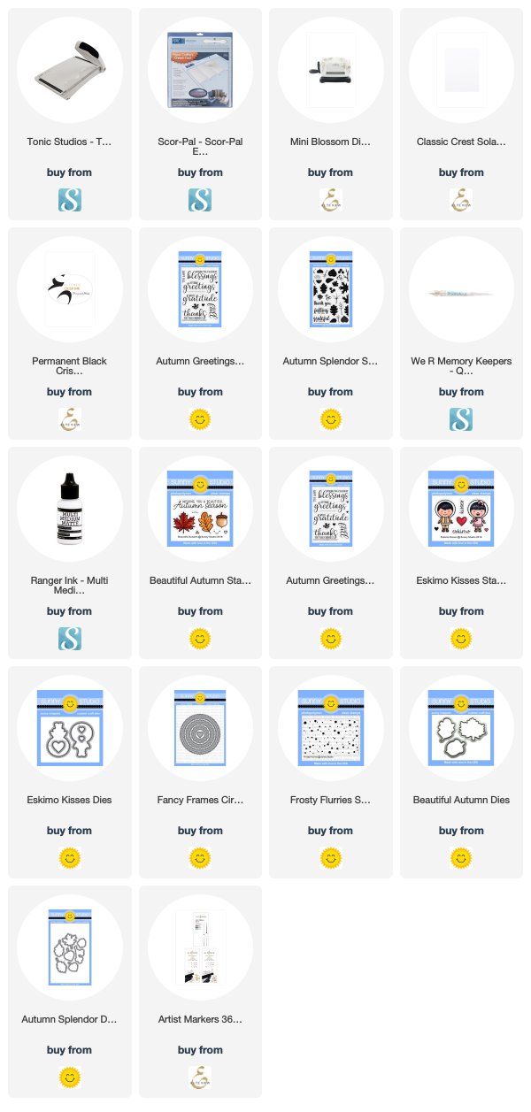
Here are some affiliate links to some of the products that I’ve used:
I’ve also created a video tutorial for this card:
I’m delighted that you stopped by today! Cheers!


