You know that feeling when you open the mailbox and there is a package from one of your favorite stamp companies just waiting inside the box for you? It’s a great feeling! I ordered a new stamp and die set from Altenew and there it was waiting for me yesterday. I immediately had to play with it.
I ordered the Modern Fox stamp and die set. I haven’t been ordering many bundles lately. The dies that I do order tend to be stand alone dies that I can find multiple ways to use. I recently purchased a Brother Scan-n-Cut to use for cutting out my stamped images. I figured that if I don’t purchase the coordinating dies for the stamp sets that I purchase, it will pay for itself after I’ve used it on those stamp sets 15-20 times. I’m learning how to use it and I will create some videos of that as I go along to share with you.
I did purchase the coordinating die set for this set because I knew that I would want to create scenes with this set and the dies just tend to make that easier.
I took one look at this set and realized that it either needs snowbanks or rolling hills behind it!
I loved this little fox as soon as I saw it. The fox and tree are layered stamps from Altenew and I always love the dimension and detail you get with layered stamps.
I did some masking to create the scene with the fox sitting in front of the tree and then I created my hill stencil out of an old overhead projector transparency and ink blended the hills and the sky.
It was a bit of a chore to do the ink blending. I just struggled to get the inks to blend and not blob. In the end, I loved the background but the beautiful fox and tree looked like cartoon images in front of a pretty background. The looked flat and dimensionless. Even my husband said that when I asked what he thought of the card.
The bottom fox is just the body and the legs stamped (and not correctly aligned). The top image is the one that I correctly aligned and then added some alcohol marker details to make the fox and the tree look more textured.
I began by stamping the fox and creating a mask out of the Inkadinkado Stamping Mask Paper. There are 3 parts to the fox image that include the body, the legs and the face.
I used Altenew’s Firebrick ink for the fox and decided that it was way too orange. Luckily, I was using my MISTI stamp positioner so I could stamp over the top of the Firebrick ink with the Hazelnut ink. This toned down the bright orange and gave it a more natural look and I quite liked the color I ended up with.
Now lining up the legs took some practice, but the face was easy to line up. I used Altenew’s Obsidian black detail ink for the legs and face.
Once I had the fox stamped, I placed the mask over it and then stamped the tree in Mountain Pine and Milk Chocolate. This is one of my favorite color combinations. It makes beautiful pine cones on pine boughs for winter cards.
I place a mask over the trees and then began creating the hills in the background. I used a combination of Forest Glades, Moss, and Fresh Leaf inks. I like the yellow tone to these inks and they didn’t compete with the deeper green of the tree. I cut out a wavy stencil for myself out of an old piece overhead transparency. Any plastic would work, as would card stock, Post-Its, or mylar. I like making things like this out of plastic materials that I can slide into my template file and reuse multiple times. With these templates, you can create one hill with the template turned one way and then flip it over and create the next hill in the other direction so that it looks like overlapping rolling hills.
I added a little of the Milk Chocolate to the top of the highest hill and to the bottom beneath the fox and tree. I added a little Eastern Sky ink to the top of the card.
I struggled with blending my inks even though I was using the Picket Fence blending brushes and Altenew inks. The combination usually makes it a breeze to blend. I’m not exactly sure why they weren’t blending. I will make sure to use Bristol card stock the next time I make an ink blended scene and I will start off the paper like I used to with the blending tools from Tim Holtz.
A couple of tips I have for getting your blending to cooperate:
- Spritz your blender brush with a little water. This really did help the inks glide on the paper better. That is a tip Vicki Boutin shared in one of her Live videos and it was very helpful.
- Keep adding layers until you get the look you want. I usually take the lightest color and blend it over the top to fill in any spaces and it does a nice job of making it look cohesive as a final touch.
- Use one of the smaller blender brushes in your set and hold your fingers on the head end of the brush to get the ink exactly where you want it.
Once I had the background looking okay, I removed the masks. That was the moment that I realized that I loved the background, but my fox and tree looked like cartoon images in front of that blended background of rolling hills. The looked flat compared to the background.
I pulled out my Altenew Artist Markers Set E. This set has 4 orange colors from light to dark that includes the Firebrick and it has 4 greens as well. I proceeded to add some alcohol marker flicks starting with the darkest shade and working along the edge of the image to flick into the white band left around the fox by the mask. I added some flicks and dots in the middle of the body to get it to look like fluffier fur. I did the same thing with the next 3 shades to fill in the spaces. I just added flicks and dots to the fur in the 4 shades giving the image some texture. I did the same thing with the green markers in the set with the tree.
In the end, I was very happy with the final result!
Taking Mindy Baxter’s Copic classes gave me the idea to fix the fox and the tree in this way. I’ve been amazed by what some flicks and dots of color can do! I also know that it’s not just using one color to create the texture, it takes 3-4 shades of that color to give the texture.
I’ll add a sentiment to this when I am ready to send it. It will be a great card for a guy!
Check out my video and you can see the process I went through trying to fix things along the way!
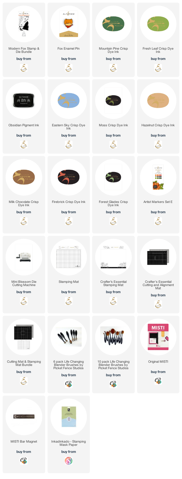
Supply List:
Are you interested in the products I used? To make them easier for you to find, I have linked them below. (Affiliate disclosure ) Your purchases help keep my blog running at no additional cost to you and I thank you for the support!
Thank you so much for stopping by! I hope you enjoy the video!
