I finally had a chance to sit down and watch the lessons for the Color Theory class I signed up for with Debbie Hughes. I love to watch her watercolor. She is truly a master watercolor artist and she makes it look so easy. During the class she said that she didn’t know anything about color theory and how to select colors for a project when she started, so she educated herself by taking classes and watching videos of people who did know. I’m sharing 3 projects from the class today, the last one reluctantly!
You know how it is when you are first trying a technique you have not tried before. It’s hard to show anyone what you created as you practice the skill. I will confess that I threw out my first 2 tries before I got one I thought was okay to share. I tried to copy what Debbie Hughes did and hers was so pretty. Mine is a good ole college try!
For the first project, she had us make color wheels using only red, yellow and blue watercolor paint so that we could mix the secondary and tertiary colors. I enjoyed this task but I truly struggled to make purples!
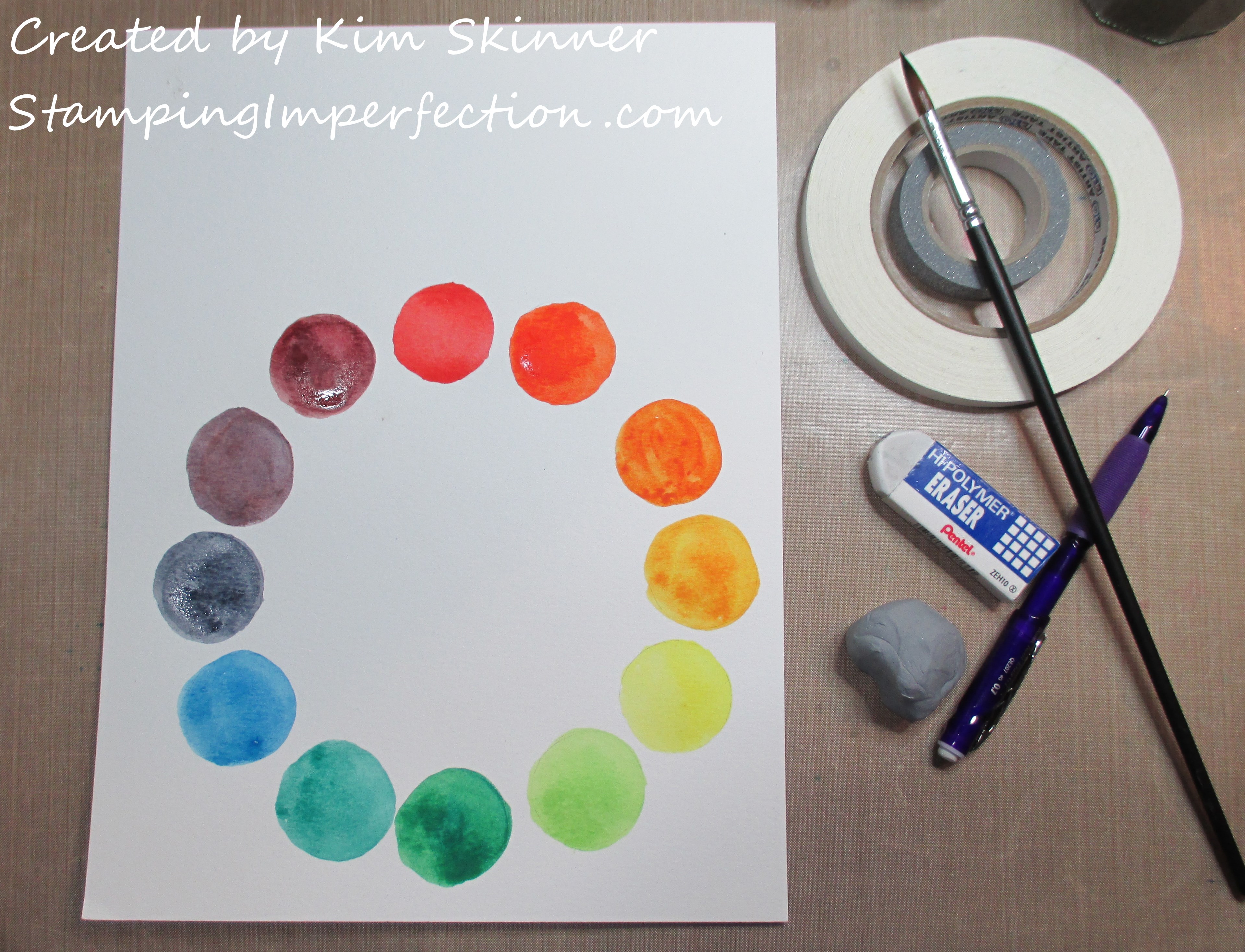
You can see the two rolls of tape to the right? I used those to draw light pencil circles to create the color wheel.
I always find tasks like this helpful. Mixing colors to get other colors is a useful skill. I actually took a color theory class through Altenew Academy and the instructor for that class was excellent as well. I purchased an inexpensive color wheel after taking that class, but I really liked the exercise of creating my own. I now have another tool to help me select colors for my projects.
If you have been reading my blog over the last year, you know that I’ve been creating color swatches of all my ink pads, markers, pencils and paints. It is such a great way to see how your inks behave on different materials and how they actually look on the papers you want to use them on before you start a project. These are great resources to invest your time in.
The second project involved making a shade chart for a color. I used blue. The center circle is the blue straight from the pan. I lighted it by adding water to my brush each circle to the right. To get the darker shades, I added a little black to the palette. This was also a useful task. Have you seen those videos on Facebook of someone painting leaves by starting with using black to outline everything and working toward lighter colors until suddenly you have the illusion of leaves, but they didn’t actually paint the leaves? I find that fascinating!
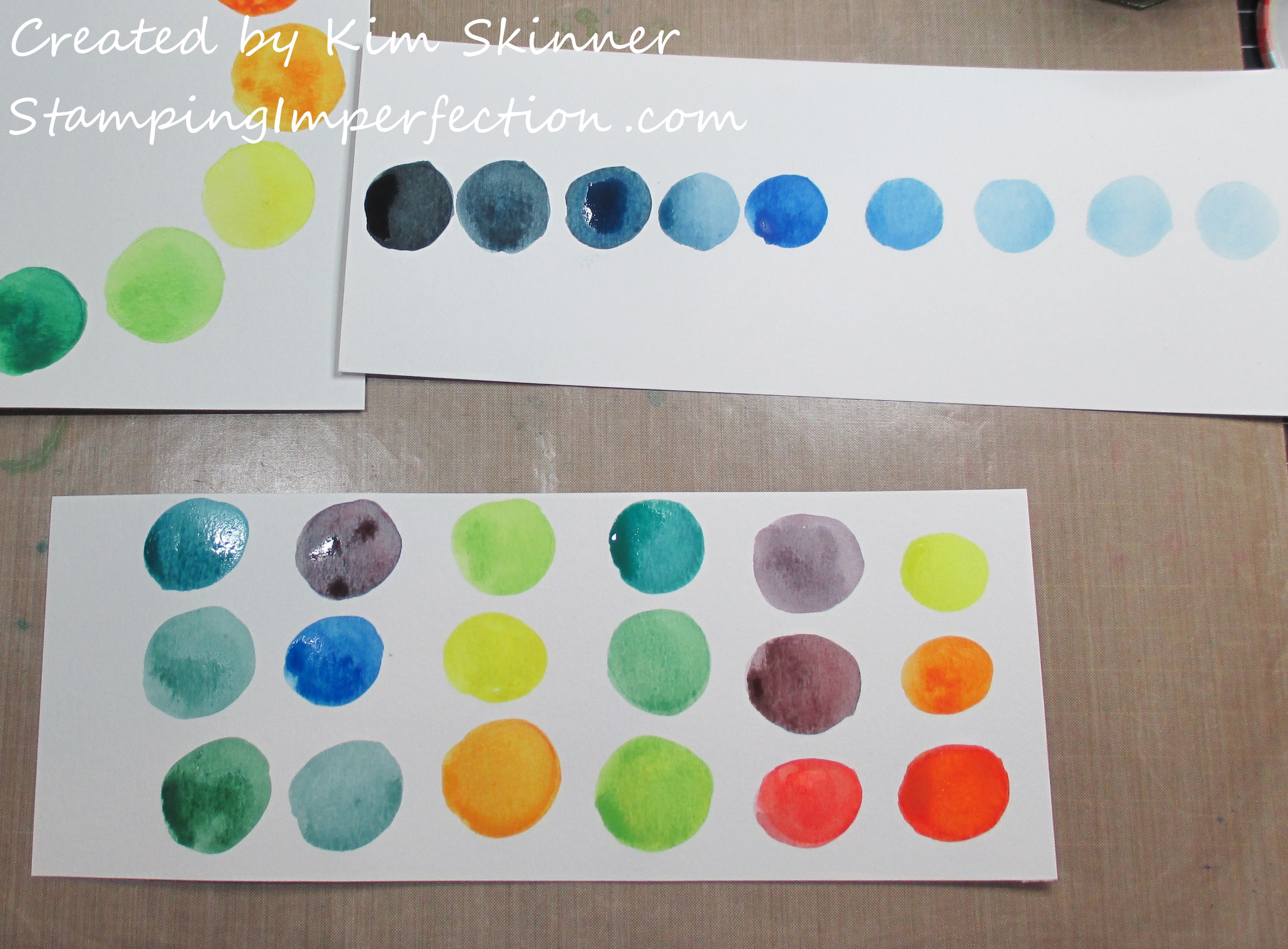
Then we created rows of analogous colors. 3 or 4 colors or hues next to each other on the color wheel will look pleasing to the eye on a project. Can you tell that I really like making shades of blue/green? My purples need practice.
Here is the card that I am reluctantly sharing from this analogous colors lesson:
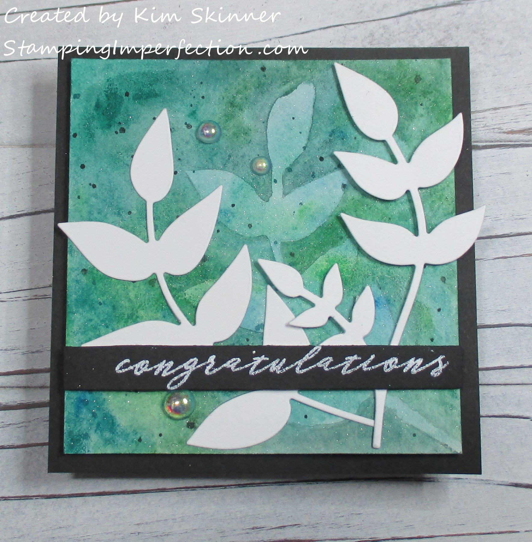
I think my background needed to be darker. This one is a huge improvement over the last try because I started by outlining the leaves first and that left me with dark lines I simply could not get rid of around all the leaves. This is a big improvement. I will definitely try this more because I love the technique and I want to master it. It’s so pretty when done by a master!
You should see the one Debbie Hughes made. Clearly, she’s practiced a lot and experimented to find her style. Every crafter that I’ve taken classes with has said that it took a lot of practice to do what they are doing…one woman said that she practiced and watched YouTube videos for 2 years before she felt like she mastered watercoloring and colored pencil techniques. She was also amazing. My point is that these coloring skills are not skills that you do a couple of times and you’re good to go. They all take practice.
Luckily, watercoloring and coloring with markers and pencils is very relaxing. It is not a hardship to practice!
I used some Altenew dies and the Garden Silhouette sentiment. Here I decided to use my Koi watercolors instead of my Altenew ones because I have not played with these yet beyond swatching them. I wanted to see how they reacted on a couple of projects. It is a pretty nice little kit!
The bubbles are from Studio Katia and I order them from Kat Scrappiness. I’m including some affiliate links below:
Click here for Bubble Embellishments

This is a fun shop because you can get a variety of stamping supplies and they have a nice selection of sequins and embellishments. Plus, they are giving free shipping on orders of $100. Click here for details.
Several times I’ve purchased from Kat Scrappiness because the supplier was out of stock of their own product and low and behold, I found it in stock at Kat Scrappiness! That’s actually how I found them!
I’m just procrastinating grading papers! I have a ton of school work to do and I must get to it. Sigh… I just want to craft!
Thank you for stopping by!


