The beautiful little coastal town that I live in attracts a high end crowd from “the city”, as in New York City. We have beautiful parks, beaches and piers. We also have amazing restaurants. Plus, local wineries and breweries keep popping up all over too.
As a result of being an attractive destination for a high end crowd, we have a lot of boutiques and art shops that cater to the crowds. (I shop at the book store, the bakery and the shirt shack!)
An item that I’ve noticed in one of the pricey little boutiques was the artistic cards in the window. These are clearly handmade cards and they are minimalist cards. I mean it. The have a tiny image in the center, colored in with a simple sentiment. Done.
I look at those cards and think, “I could do that!”. You would be thinking it too!
I started taking a new class today called Boutique Cards. (It’s part of an Educator Certification program at Altenew Academy. I was very excited that my application was accepted into the program because I’ve been enjoying taking classes through them and experimenting with their products. It’s all part of my odyssey to become an expert papercrafter. You know that I believe that I must try all the stuff and practice with it to become an expert. All the stuff.)
Well, the lesson was to keep things minimalist and to add some hand drawn elements.
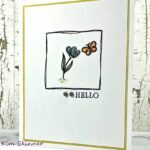
Here is my creation:
I used Altenew’s Floral Shadow stamp set along with the Volcano Lake and Mountain Mist inks. The sentiment is stamped in permanent black ink and it came from the same stamp set.
Then I took my Copic Multiliner Black Marker and drew in the leaf details and the floral centers. Boom! Done.
Honestly, I might have used more colors if I had more of the Altenew inks. I have a few colors to try out and the variety of my color palette is limited.
I do love monochrome cards and I really like just winging it with markers! Once I stamped with these colors, I loved them so much I did not want to add any other colors to them. I love this combination of the black, white and the two tones of this blue-green color.
I used my MISTI to place the stamps exactly where I wanted them on the card to create my layout. The MISTI also allowed me to stamp each image twice for complete ink coverage. I did not worry about overlapping the images, I just stamped 3 images and the sentiment.
This could not be simpler.
I was tempted to add some sequins, but the point was minimalist. It’s hard not to add embellishments. I so love my bling!
I took a line drawing class from Brit & Co over Christmas vacation and it was all about not trying to make perfect lines. This instructor said the same thing. Just go for it and don’t worry about perfection.
Embrace the imperfections!
That has been my mantra forever. I teach physics, but I think the most important thing I teach my students is that problem solving is not about perfection, it’s about partial credit! Do what you can to the best of your ability and stop worrying about getting everything perfect.
Be bold and wing it! You’ll be surprised by the results and you’ll enjoy it so much more!
I’m going to make more simple boutique cards. I think I will donate them to my little Seaport Museum and they can sell them to raise money to support the marine education programs for the kids.
Thank you for stopping by today! Enjoy your day and remember to embrace the imperfections!


I love this card Kim. So clean and the colors are beautiful. It sounds like you are really enjoying the different classes you are taking. I wish I had that opportunity in my area but not so much lol. Thank you for sharing!
Thank you Anita! There is talk of a new arts and crafts shop opening in town. We are all waiting to see if it happens!