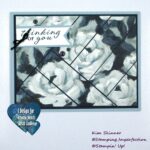
When you first see a card or a card sketch like the one I created the other day, you probably have something in your stamping stash that you think of immediately to use with the sketch. For me, it was the Deco Label Framelits. I love them, they are new and I’m looking for cards to create with them. As soon as I created this sketch, I knew that I would be making a card and using that for the center element.
Other times, you will look at a sketch and a stamp set or a designer paper will come to mind. I love the Venetian Romance Designer Papers and I knew that I would use this sketch to showcase my favorite paper in that set. I also think of the Feels Good sentiment set with this sketch because it would allow those fabulous sentiments to really be the focus of the card.
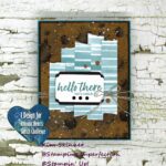
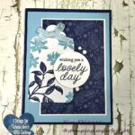
When using a card sketch, one of the things that you will need to select is your background. I have 6 quick options that you might use with this sketch. Along with the background, I had to select the beginnings of my color schemes for each! Above you will see that I have layered that Venetian Romance Designer Paper on top of my card base. My color scheme will come from the colors used in the designer paper itself. On the left, I’m just using layered card stock as my background. I had a soft suede mat and decided to use the Color Coach to choose my color scheme. It suggested Pool Party and Daffodil Delight with the Soft Suede…interesting. Layering card stock or using designer paper are quick and easy solutions for your card backgrounds.
Here are two other great background choices. On the left, I’ve used Sahara Sand Core’dinations card stock with the Wood Grain Embossing Folder. I layered that on top of Night of Navy card base. On the right, I’ve used the En Francais background stamp and stamped it in Summer Starfruit on Very Vanilla. This is layered on a Midnight Muse card base. Embossed or stamped backgrounds are excellent background choices for adding texture and interest to your cards.
My final two suggestions include faking the layers. On the Whisper White card base I used my Simply Scored and just scored some lines to define the background of the card. This is simple and inexpensive once you have the Simply Scored tool, it’s free to make a background like this. It’s understated and lends an elegance to a card. On the right, I’ve chosen to use markers to add a background border. Here I’ve used the white “chalk” marker from the Holiday Catalog on a basic black card base. I’m already thinking about the Chalk and Talk images and the chalkboard technique for that card!!
Tomorrow, I will add my central image and shape to the cards. This will really show you how one card sketch can be interpreted in so many ways! It’s all a matter of personal preference and what you have in your stamping stash to work with!
If you would like to add tools to your stamping stash, you can purchase your Stampin’ Up! supplies online at mystampingstore.com!
Earn free stamping classes each month by joining the Virtual Stamp Club! Get details by clicking here!
Join me tomorrow for Part 3 of the Start With A Card Sketch series: Images and Shapes!
