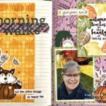
This is the first time that I’ve ever purchased an entire scrapbook collection of items from paper to ephemera and stickers. I so loved the Simple Stories Vintage Autumn Splendor collection that I bought the entire set of materials.
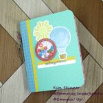
So far, I’ve created a traveler’s notebook that I am using as a gratitude journal for fall and I’ve created the interactive album that I am sharing with you today.
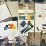
I decorated the cover with bits of papers and ephemera from the collection.
I apologize that these are not my best photos. I’m feeling a bit under the weather thanks to seasonal allergies and I was excited to share this with you.
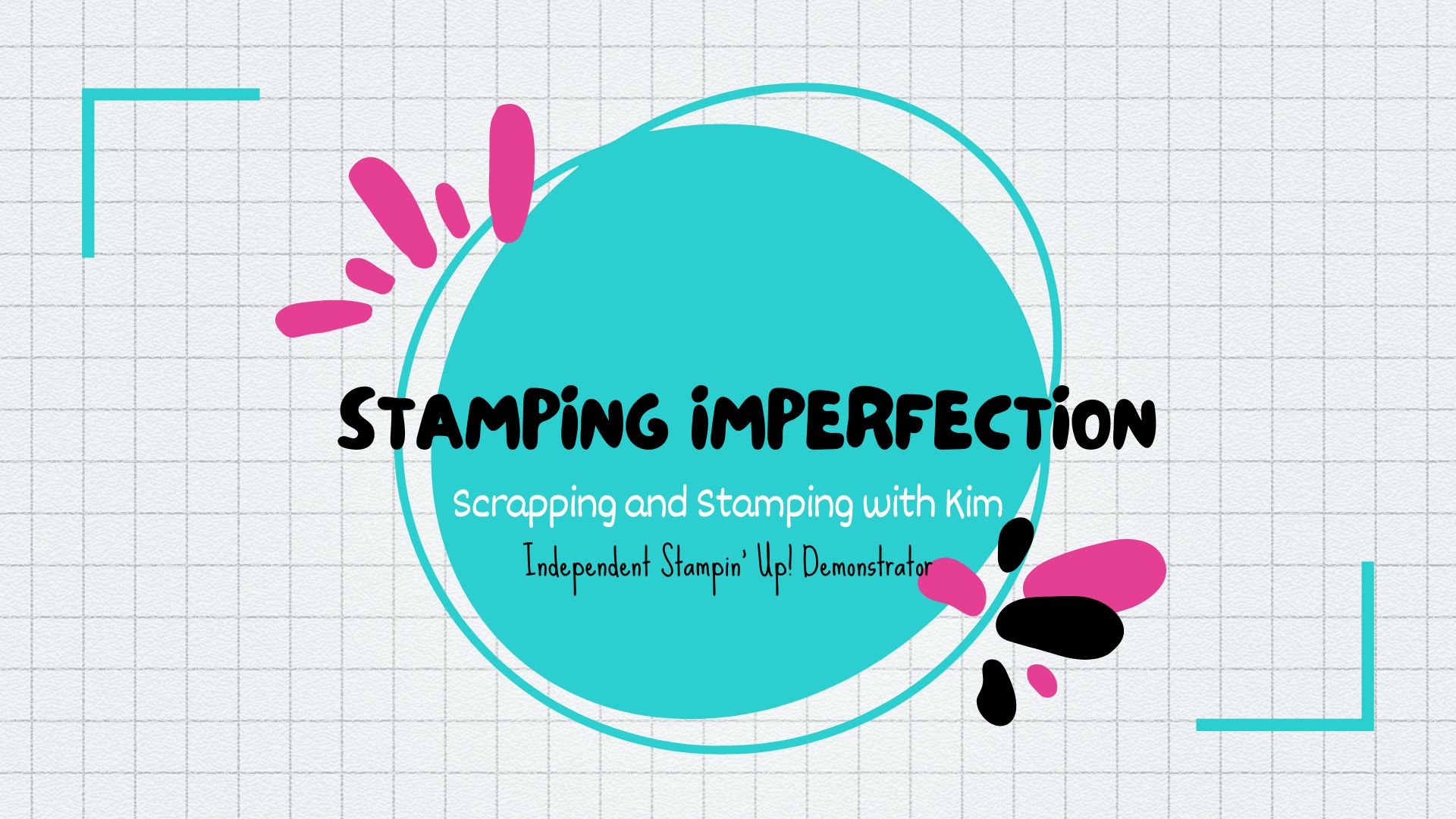
This is the very first 6 x 8″ interactive hybrid album that I’ve designed and created myself. I LOVED every single minute of creating this. I already purchased the Photoplay Christmas collection for the album I plan to design and create next.
I have a few pages to show you in photos, but I created a video going through each page and showing you what I started with.
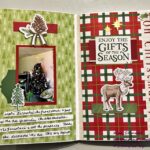
This is one of my favorite quotes and I just fell in love with the artwork on these papers. After doing two of Vicki Boutin’s album classes and a class with Layle Koncar, I have learned the value of using an entire collection to create an album instead of just purchasing things piecemeal that I think coordinate together. The designer of this set spent a lot of time coordinating the collection, so why would I not take advantage of that person’s expertise?
I’ve created lots of pockets and flip doors in this album. The gray ticket on the left page pulls out so I can journal on it and slide it back in. The flap on the top right page flips up so I can add a photo or some private journaling.
I’ve used some of the plastic pocket pages in a variety of configurations like this page. I’ve created a flip up flap for extra photos or journaling that extends outside the pocket.
The right page here uses one of the cut aparts to create a pocket that I’ve placed two tags in that can be pulled out for journaling and photos. People looking at this album have a lot to see!
This one has a flap on the left and a pocket with pull out tags on the right. I supplemented my pages with some premade mixed media pages from Vicki Boutin’s 6 x 8″ foundations paper pad that coordinated with the fall colors used in this collection.
Another pocket with tags here as well. Before doing any cutting, I created a set of sketches for each paper that I drew to scale. I did cutting diagrams and layout pages. I really spent several hours planning out everything before I cut into a single paper. I was really trying to preserve the art and the details on each paper that I loved.
I really enjoyed creating this and it took several days to do. What a relaxing way to spend several afternoons and evenings!
Two pages with a French Door style flap set.
I learned a lot creating this and my next one will be fun to create. Check out all the pages and supplies with this video I created to share my “masterpiece”!!
Supply List:
Are you interested in the products I used? To make them easier for you to find, I have linked them below. (Affiliate disclosure ) Your purchases help keep my blog running at no additional cost to you and I thank you for the support!
Thank you so much for stopping by my friend! Your visits are always appreciated. Please leave a comment and let me know what you think of my first interactive hybrid album design!
