Lucky me! I had a box of crafty goodness waiting for me when I got home from work today! What great timing. We are in the middle of this crazy Nor’Easter winter storm and it is nice to have time to just experiment with some new tools in my craft room.
Many of the instructors of my classes have mentioned that Ocean Waves, Sea Glass and Coral Berry are among their favorite Altenew ink colors. I finally got them and I could not resist trying them out! I recently completed a class called “In The Mood For Color” so using two new sets of ink colors seemed like the perfect moment.
Altenew’s inks can be purchased in sets of four coordinating colors. I love that they package them like this with all of the layering stamp sets that they sell, it takes the guess work out of trying to decide which shades and colors will coordinate when you put them together into these beautifully layered stamped images.
I chose to use the Build-A-Flower: Sakura Blossom stamp and die set. It’s pretty forgiving as far as lining up the layers and the dies, which is nice since I am feeling a little under the weather today. I just wasn’t in the mood to fuss, but I really wanted to play with the new ink colors.
This class was interesting since it focused on the mood we create and convey by using certain colors for our main images. I love the psychology of this. I think most of the time, my color choices are really subconscious. I don’t think about why a certain color calls to me for a certain card or project instead of another. I guess I assumed that the colors that I picked tended to reflect my mood. I think that for the most part, this is true.
The important point of the lessons in this class involved selecting the colors based on the feelings we are trying to convey with our cards and projects to the recipient. How often have you used muted color or black and white for a sympathy card, for example?
I got the Cool Summer Night ink set, which is a set of blues. Here is the card that I created:
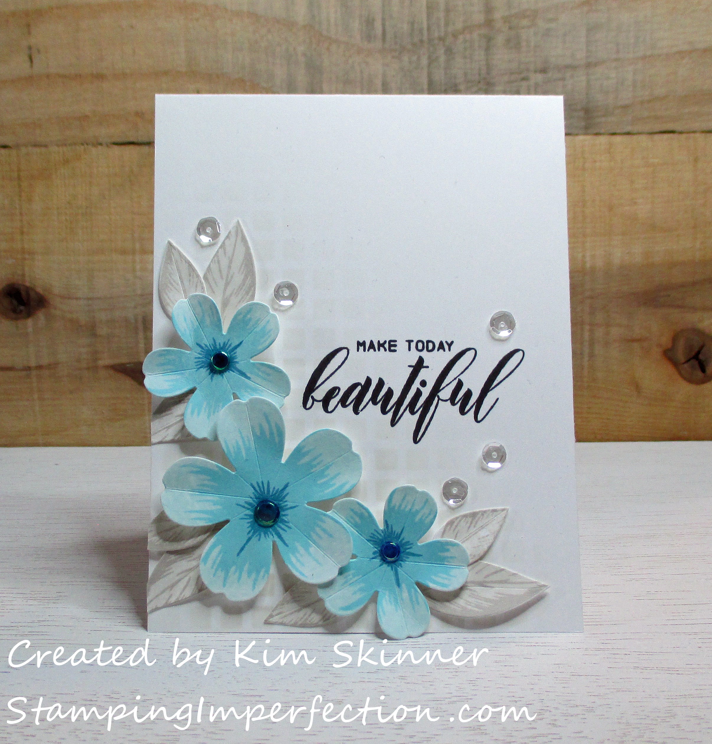
Since I wanted the blue to be my focal point, I kept the rest of the card very neutral. I used the Morning Mist and Evening Grey inks for the ink blending background using the grid stencil and also for the leaves. I just love the sentiment stamped in permanent black ink. I am finally in the habit of using my MISTI to stamp my sentiment. I like doing this because I can stamp it twice to get a perfect stamped image that is really dark and crisp. I used the Desert Night, Ocean Waves and Sea Glass inks on he flowers. I’ve also added some sequins and embellishments to the card as well. These are clear sequins, while I used blue for the centers of the flowers.
I love that you really notice the sentiment and the blue flowers, while the leaves and background just fade to the back. I think they are necessary to complete the card and keep your eye flowing around the card, but they don’t take your attention off the star of the show…the sentiment and the blue!
By the way, blue conveys calm and tranquility. I certainly feel that with this card. Aren’t these blues just beautiful?
For my other card, I used pinks. Pink conveys sensitive, caring, sweet feelings.
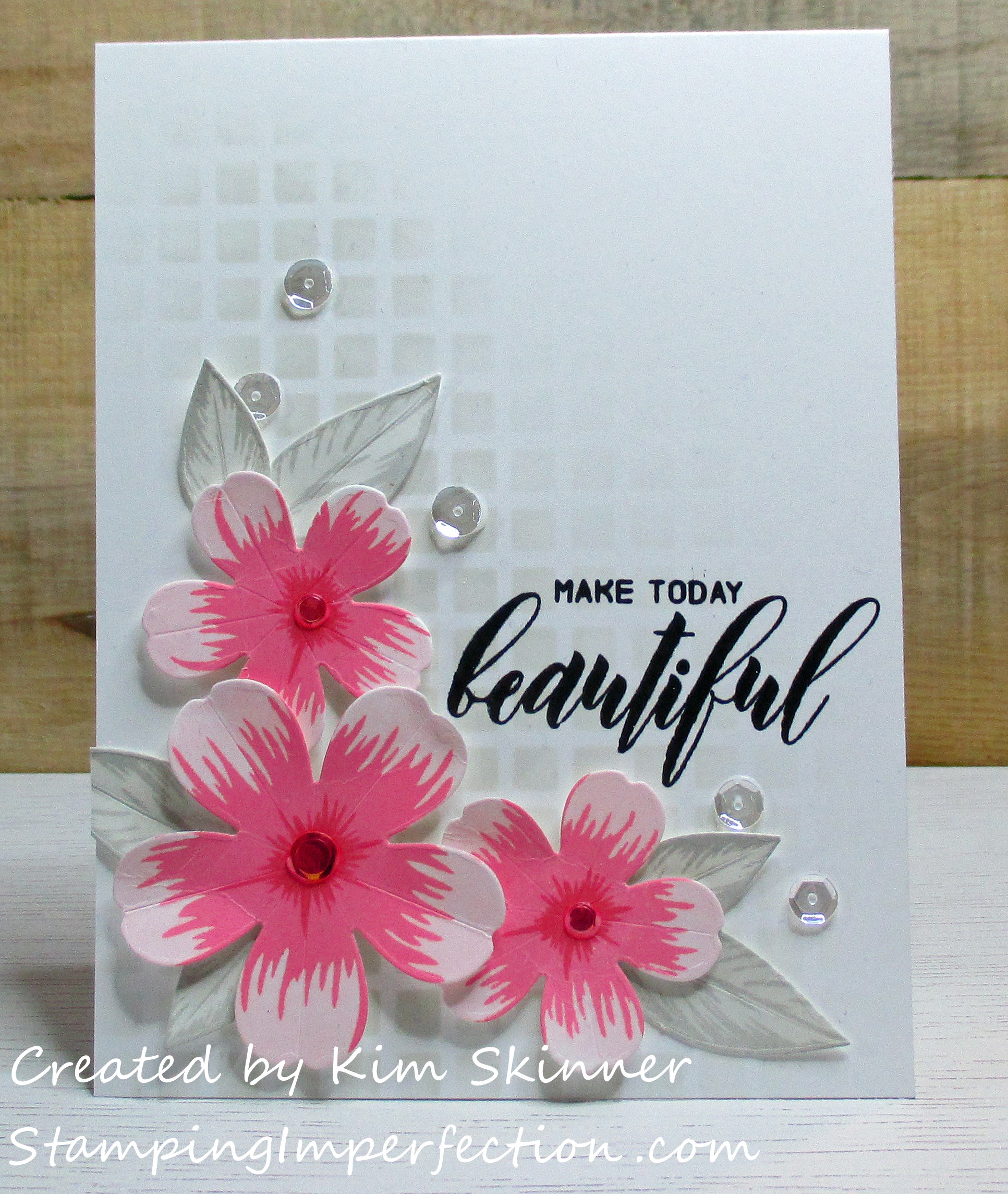
I tried to keep the card layout basically the same. These are pretty bold pinks on the upper layers, with the center actually being a deep red. Red conveys love, passion and energy and I think that is what I feel with this card with those bold pinks and reds in the center. These are from the Red Cosmos set and I have used Grapevine, Coral Berry and Frosty Pink.
I like the idea of using something other than green for the leaves. The leaves are still present and necessary for the composition and use of space for the card layout, but they don’t compete for your attention with the sentiment and that color that is conveying the feeling and mood of the card.
I also really love using the stencils to create a background with my ink blending tool. I love that faded effect that gives me the white space I so love in a card.
Besides making beautiful layering stamp sets, Altenew’s strength also comes from the sentiments that come in the stamp sets. How wonderful is the sentiment on this card? Make today beautiful. I love it! I love the combination of fonts and sizes of the fonts as well. It just makes the sentiments so much more interesting. I often have a hard time deciding which sentiment to use because there are so many to choose from and they all beautifully express what I’m trying to say to the recipient of the card.
So what color are you in the mood for today? What color will you use to convey those feelings to the recipient of the card you are making?
Thanking you for visiting! Remember to embrace the imperfections!!


Stunning!! Love how CAS these two cards are!! Your use of colors and composition are awesome, Kim! Well done!
Thank you, Virginia!
Kim these cards are beautiful. Love the colors of both but I am partial to blue. The background is so subtle but adds so much. I too would like to try the altenew inks. I decided though to invest in just the mini cubes and stick to the Stampin up ink/ paper. Thank you for sharing all that you are learning from your classes.
Hi Anita! I am also partial to that blue. The colors are just so pretty. I have fallen in love with stencils and I really love the backgrounds you can get with them. I started out with the ink cubes also and I got hooked! The colors are addicting. I am sticking to the ink cubes for the distress inks that I’m just trying out. The ink cubes are easier to store and you really can do everything with the cubes that you can do with the larger ink pads. Thank you for stopping by! It’s always great to hear from you.